Liquor Control Victoria
Helping Liquor Control Victoria redesign their website around what users actually need
Liquor Control Victoria's website is the primary tool for Victorian businesses navigating liquor licensing and RSA requirements. We partnered with LCV to understand why people were struggling to find what they needed — and to design a clearer, more user-centred path forward.

Outcomes
- New information architecture with six top-level navigation sections, validated through card sorting with real users
- Three content templates (Information, Action, and External link) giving the team practical patterns for every page type
- Six content principles written in plain language for consistent, user-centred writing across the organisation
- Content audit of 83 pages with recommendations to keep, revise, move, or remove — mapped to the new structure
- Three-phase implementation plan spanning 18 months, from quick wins to longer-term platform improvements
A website that wasn't working for the people who need it most
The LCV website holds critical licensing information, but our research revealed it wasn't structured around how people actually think or what they're trying to do. New applicants felt overwhelmed by dense, unstructured pages. Existing licence holders couldn't find repeat tasks quickly. And confusing navigation meant people were bypassing the site altogether — going straight to Google or calling LCV directly.
As one new licence holder told us: "I just Google what I need and hope it takes me to the right page, because trying to navigate through the menus is too confusing."
Listening to the people behind the licences
Over six weeks, we ran two rounds of research with 12 participants — new and existing licence holders, an industry worker, and a consultant — alongside six internal stakeholders. Discovery interviews uncovered how people search, where they get stuck, and what they expect from a government licensing site. Validation sessions with card sorting tested a proposed information architecture against real mental models, revealing how users naturally group content and what labels make sense to them.
I really appreciated the structured approach to kicking off the project, and the ways in which Paper Giant kept us updated through regular WIP and Showcase meetings
— Project sponsor
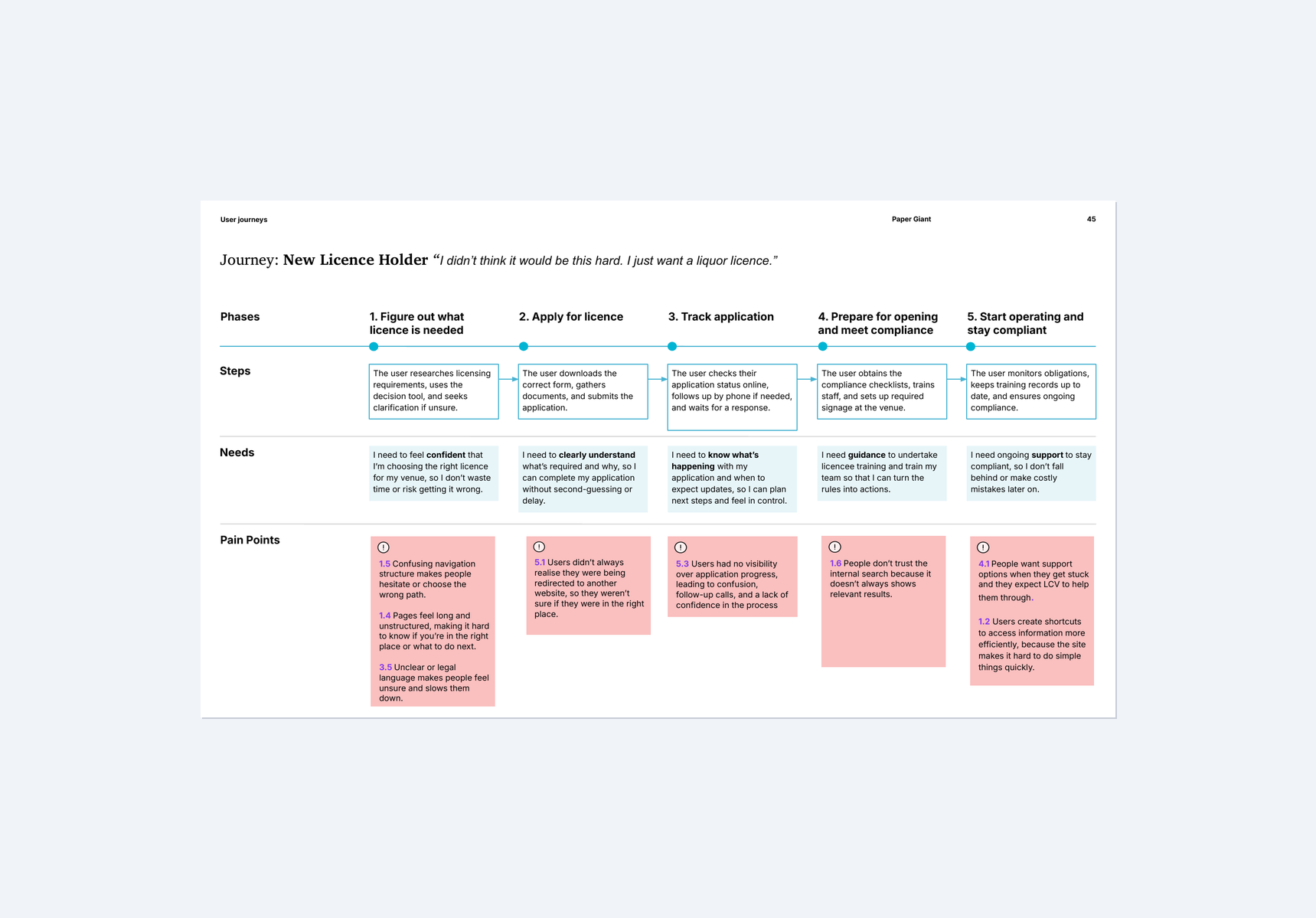
Mapping the new licence holder journey revealed where people get confused, lost, or give up — and where the website could step in to guide them
What we found: a mismatch between the site and its users
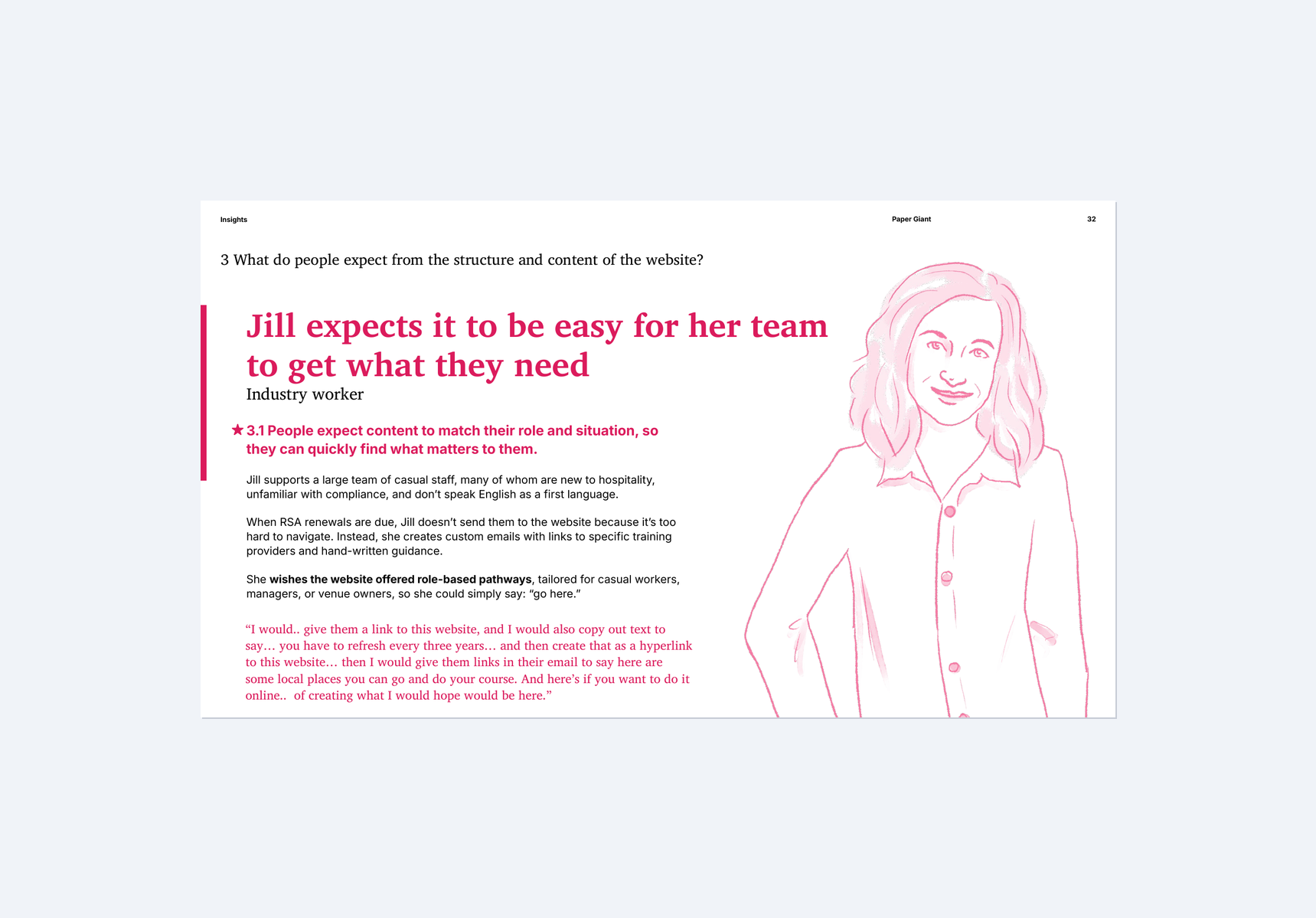
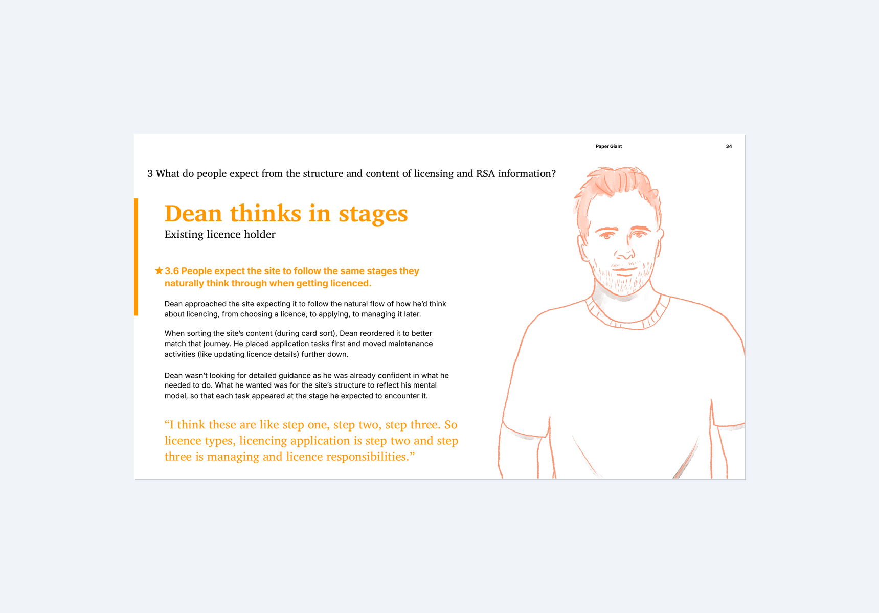
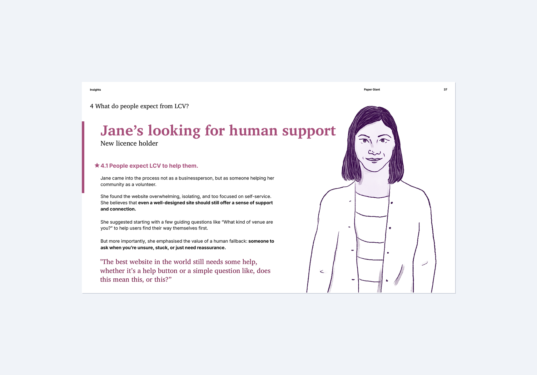
Our research uncovered six key themes. People need content tailored to their role and stage — not one-size-fits-all pages. New applicants want reassurance and step-by-step guidance, while existing holders want quick access to repeat tasks. Users didn't realise when they were being redirected to external platforms, leaving them disoriented. And the language used across the site — terms like "pre-retail" and "general licence" — didn't match how people actually talk about what they need.
As one participant put it: "You click into one page, and then you're kind of in a maze. You don't know how you got there, or how to get back out."
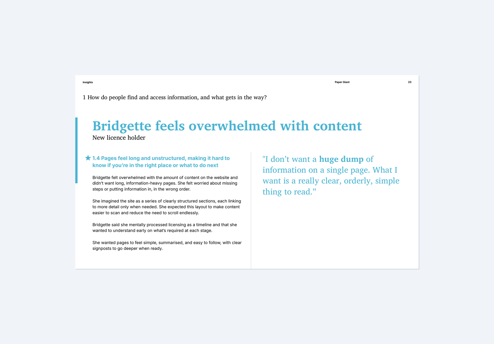
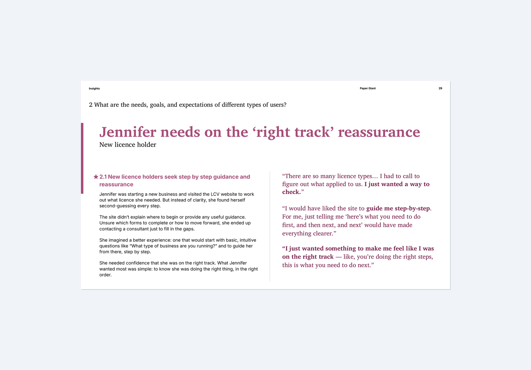
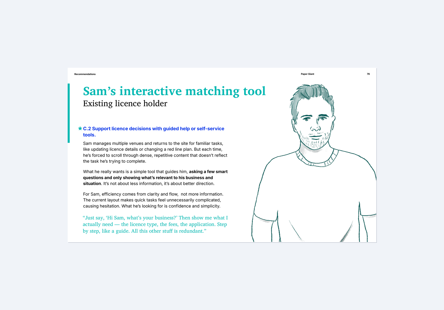
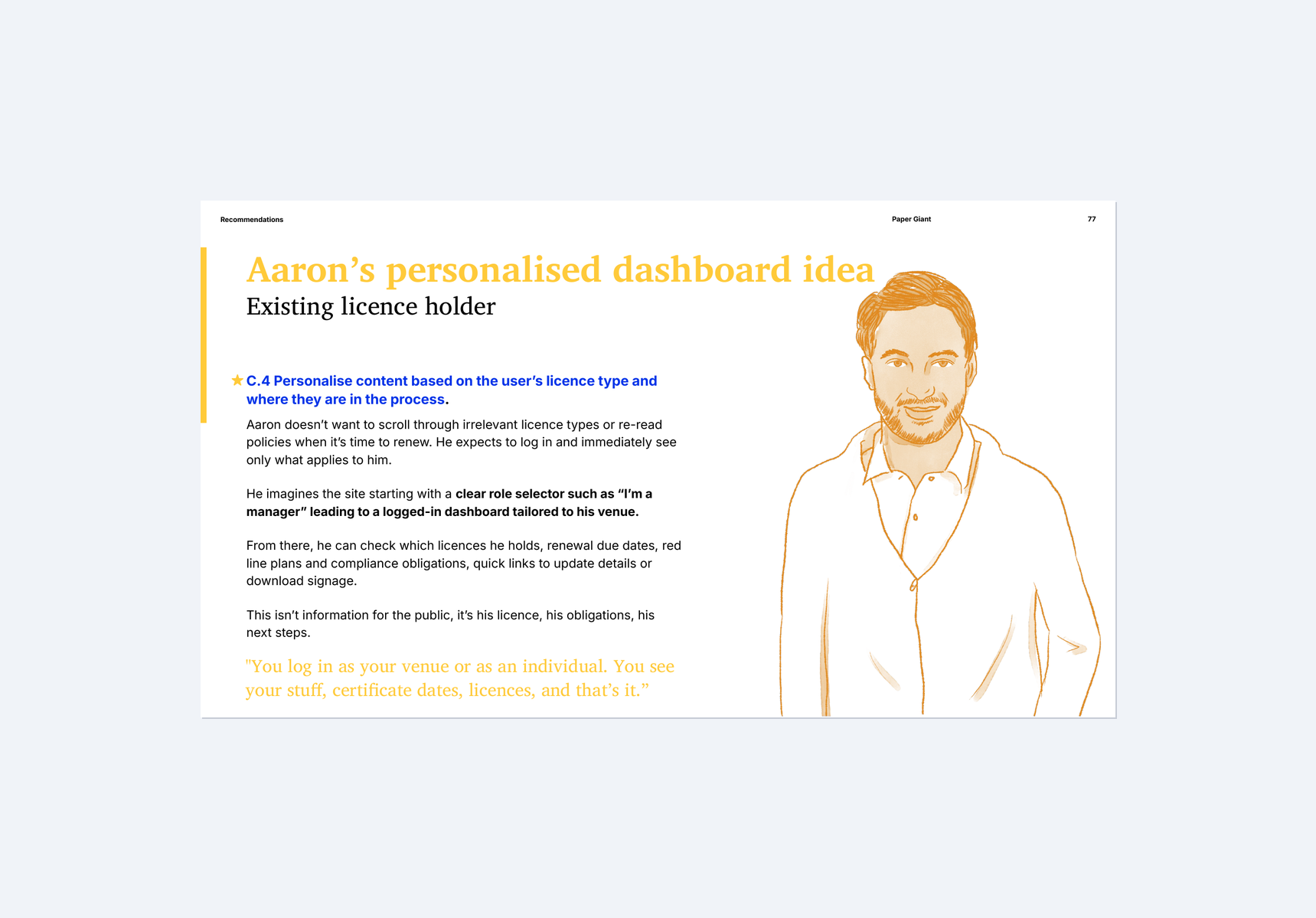
Eight evidence-based persona case studies showing how different users — from first-time applicants to experienced licence holders — experience the LCV website
From research to a practical redesign toolkit
We delivered a comprehensive toolkit designed to guide LCV's website transformation. A new information architecture organises content around six clear sections — structured by what users are trying to do, not internal categories. Three content templates (Information, Action, and External link pages) give the team ready-to-use patterns for building pages. Six content principles provide a shared language for writing clearly and consistently. And a content audit of all 83 existing pages maps each one to the new structure, recommending what to keep, revise, move, or remove.
The artifacts produced are clear and thorough and give our content and web teams very clear direction
— Project sponsor
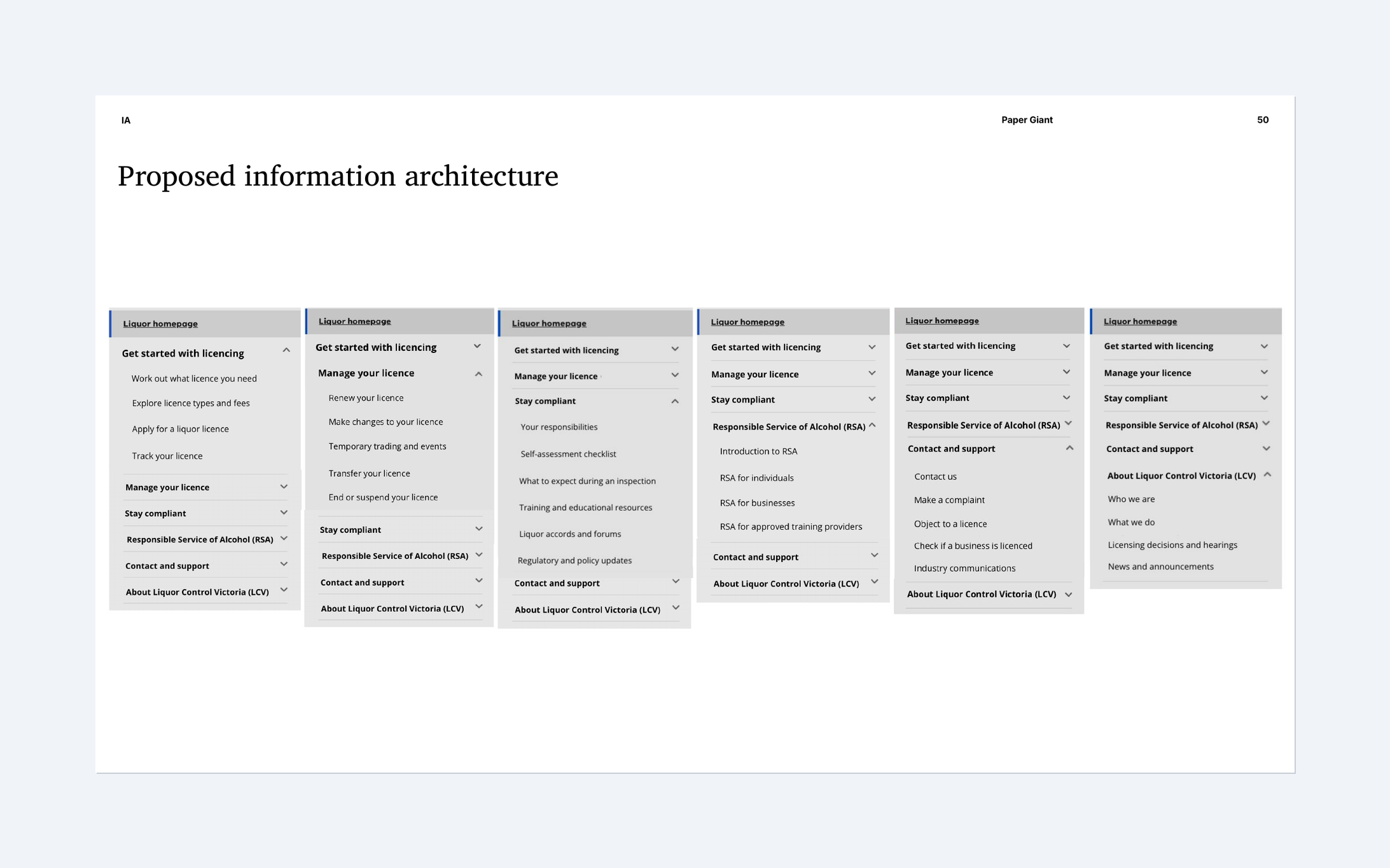
The proposed information architecture restructures navigation around user goals — tested and refined through card sorting with real users
A clear path from research to launch
We shaped the recommendations into a three-phase implementation plan, starting with quick wins and building toward longer-term improvements over 18 months. The first phase focuses on restructuring navigation and improving search. The second introduces role-based content filtering and guided decision tools. The third addresses cross-platform consistency and personalised experiences. Each phase is practical, sequenced, and designed so LCV can start making improvements immediately.