Digital Transformation Agency
Transforming Australia's Style Manual for the digital age
We helped the Digital Transformation Agency reimagine the Style Manual — the Australian government's definitive guide to writing, editing and publishing — for a new generation of public servants who need it online, up to date, and ready for how they actually work today.
Outcomes
-
Discovered that users have an intense emotional attachment to the Style Manual and expect a digital version that matches the authority of the print edition
-
Designed the information architecture and content hierarchy for the 7th edition of the Manual
-
Developed six design principles that gave the DTA a shared framework for building the digital Manual and securing cultural buy-in across government
Sectors
A communications bible that hadn't changed since 2002
The Style Manual sets the standard for quality and consistency in government communication. But its 6th edition was sixteen years old. While many of its core guidelines still held up, its advice on digital writing was outdated or missing altogether, and its guidance on culturally appropriate and inclusive language hadn't kept pace. The Digital Transformation Agency needed to understand what a modern, digital Style Manual should look like — and we partnered with them to find out.
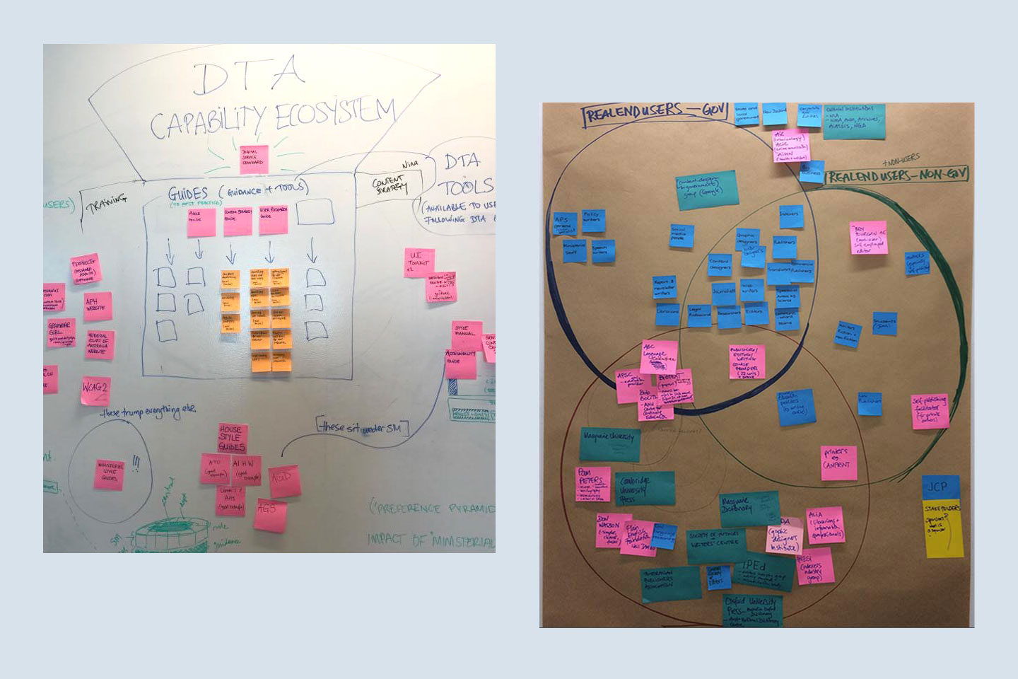
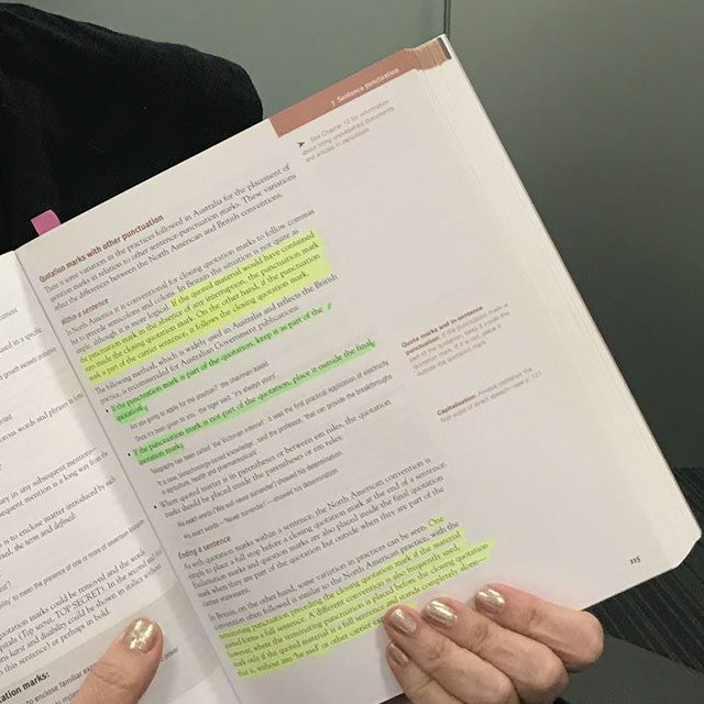
Initial research and synthesis that was undertaken to understand how the current print style manual is used.
Users who love their Style Manual — fiercely
One participant told us that without the Style Manual, "I wouldn't want to do this job anymore. My life wouldn't be worth living". Another called it their "biggest ally".
These aren't casual users. Many are professional editors with zero tolerance for errors and high attention to detail. For them, the Manual isn't just a reference tool — it's "a safety net and a companion." Our 8-week discovery set out to understand how the Style Manual fits into the real working lives of people who write, edit and publish across government — and what they need from it next.
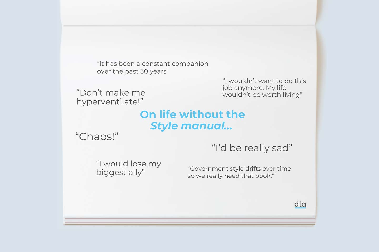
Key quotes highlighting how people would feel about life without the style manual.
Different roles, different needs — but one shared expectation
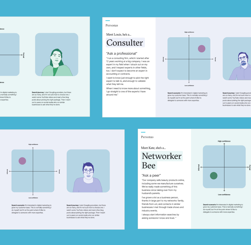
We spoke with staff at all levels across more than 10 departments and agencies in the ACT, Melbourne and Sydney. What we found was a wide range of use cases — from editors who consult the Manual daily to managers who dip in for a quick ruling — but a consistent, urgent demand for a digital version. We identified four primary user types, each with distinct needs, and mapped the journeys and tasks that shape how they interact with the Manual.
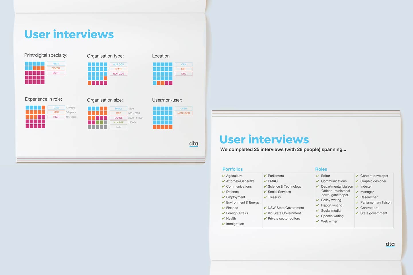
Data visualisations showing the range of different users and departments engaged as part of the project.
Designing principles that protect what people trust
Our research led us to six design principles for the Manual's future — from "Expert led, community centred" (direction set by experts with ongoing community consultation) to "Fiercely protective" (benchmarking and measuring brand indicators with each release) to "Digitally biased" (making digital the default format). Each principle answered a specific question about the Manual's evolution: who should write it, how to retain its authority, and what format it should take.
We used these principles to design the information architecture and content hierarchy for a digital 7th edition. And we pushed beyond the product itself — recommending how to build ministerial buy-in, connect with APS training providers, and protect the trusted Style Manual brand so it could thrive in its new form.
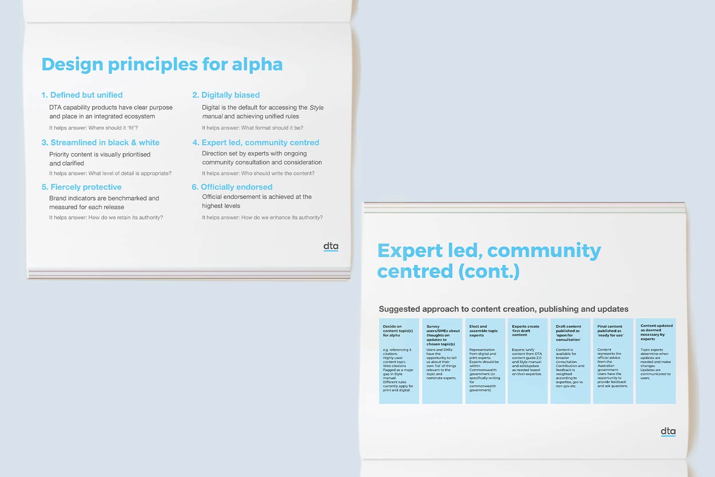
The design principles and guidance that were used to inform the digitisation of the style manual.
