AlphaBeta
Creating an energy benchmarking tool for small business
We researched small business owners and their ecosystem to learn how they think about energy spend, then designed a tool to help them save money.
Outcomes
-
Provided the Department with a deeper understanding of the behaviours of small business and their advisers (such as accountants) around energy consumption
-
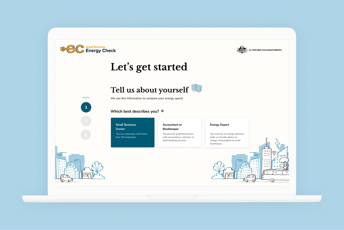
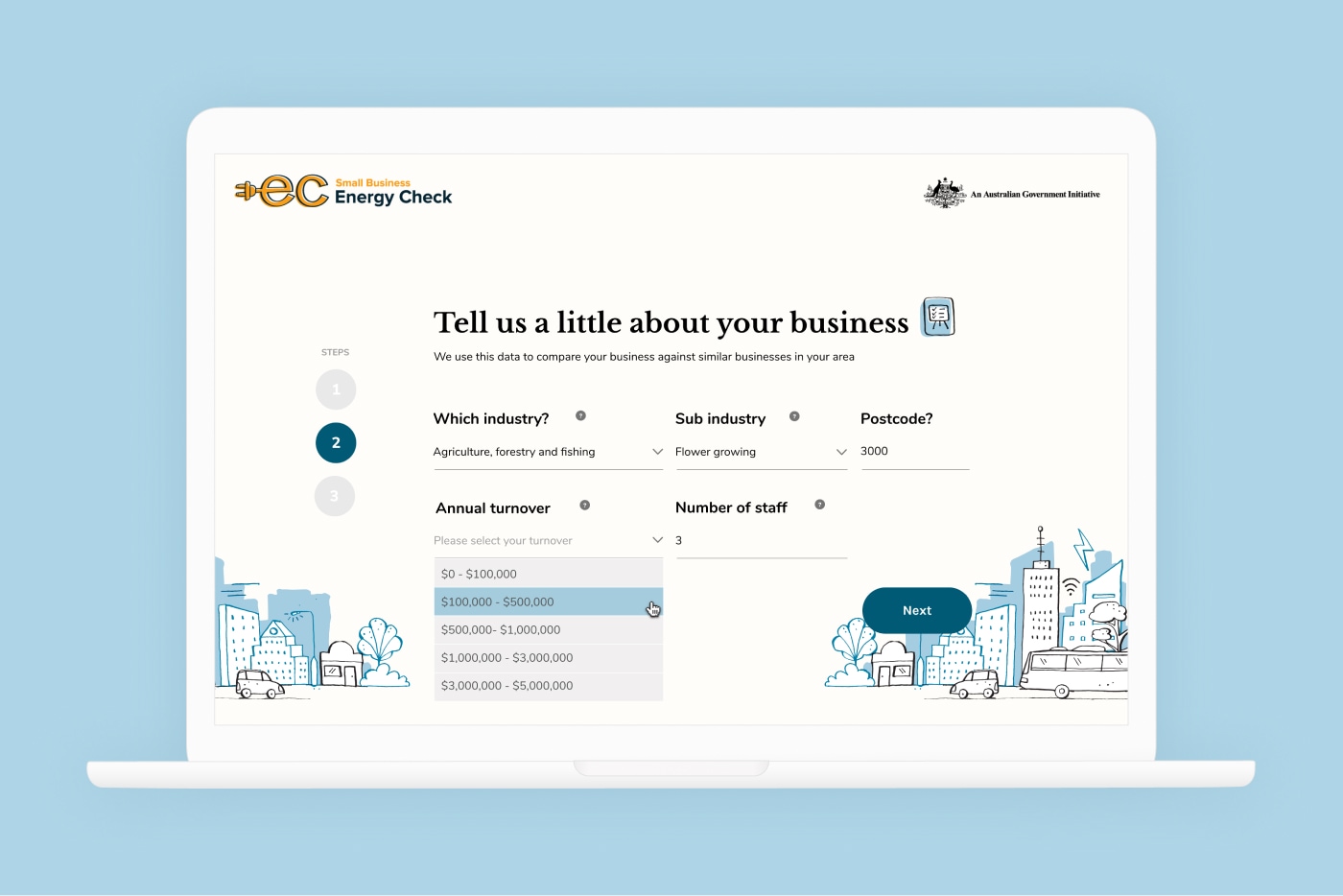
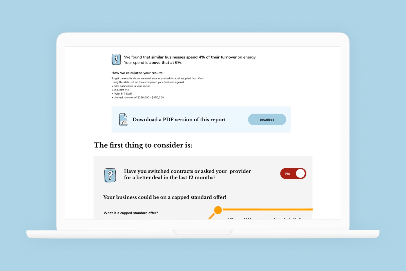
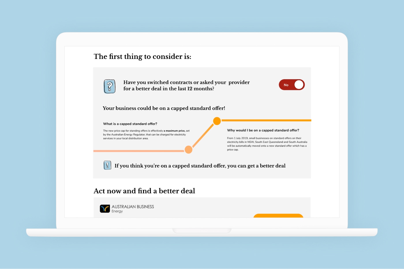
The user experience and visual design of a functioning online tool that enables small businesses to compare their energy costs against each other
Sectors
Turning data into product
A strategy and economics advisory realised their client, Xero, had a valuable data set and wanted help turning it into a product that customers would use and value. They partnered with the Federal Department of the Environment and Energy and Paper Giant to bring it to life.
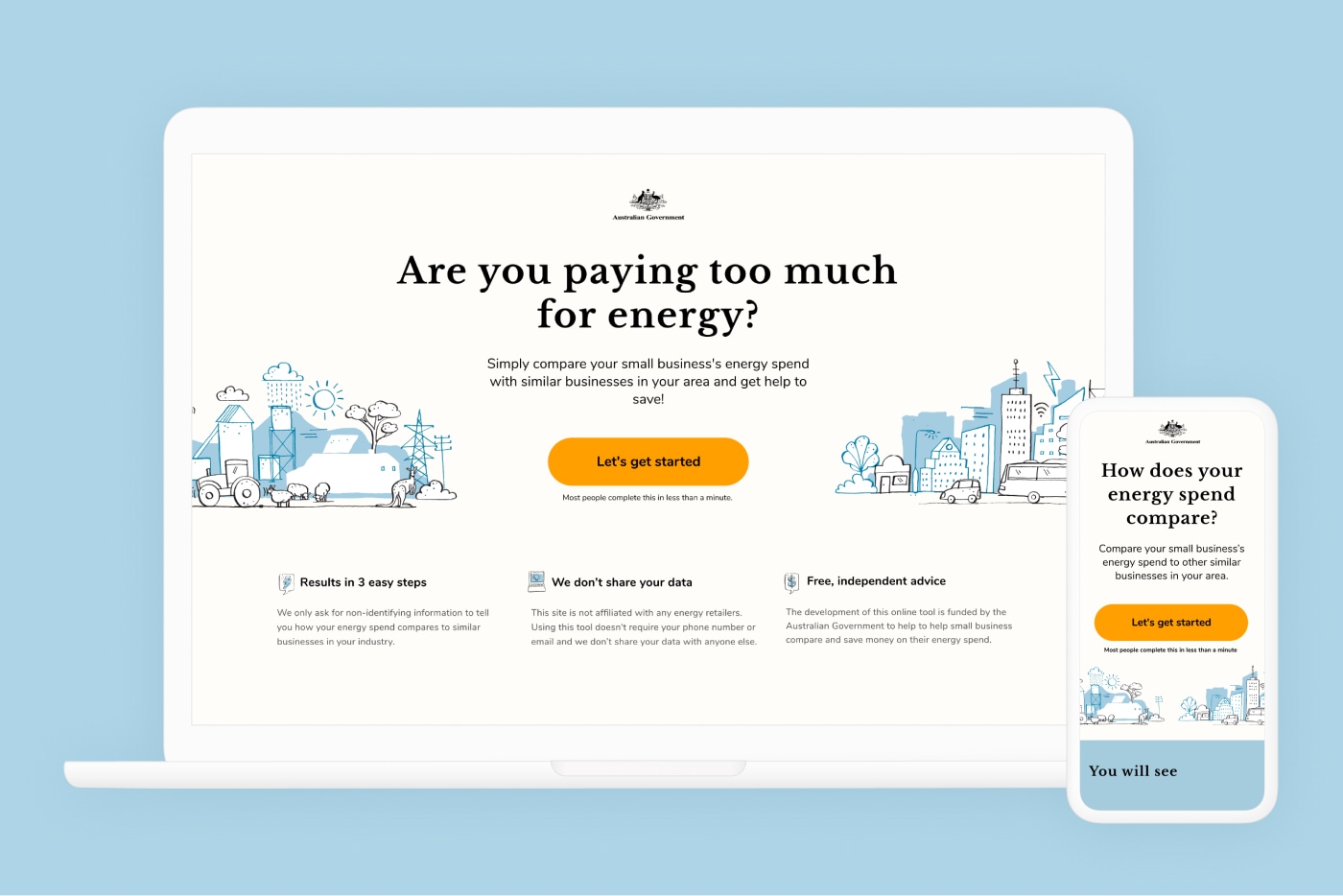
The tool leverages Xero’s highly granular data on small business energy spend to help users understand how their energy consumption compares to other business in their region, sector or of a similar size. The benchmarking tool was launched in August 2018.
Learning what small business customers want
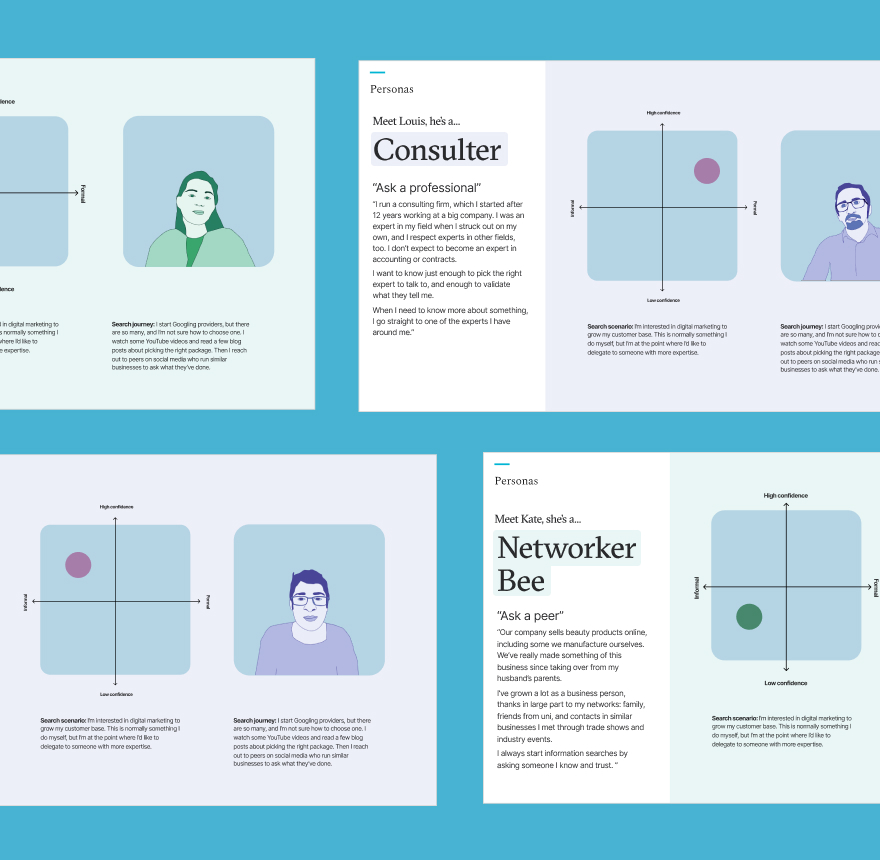
We had three research streams: the first was exploratory, looking at the whole ecosystem around energy spend. For example, we found that most small businesses only really start to think about their energy usage after receiving a blow-out bill. We researched other energy comparison tools, including state government tools, to make sure AlphaBeta’s would be complementary rather than in competition.
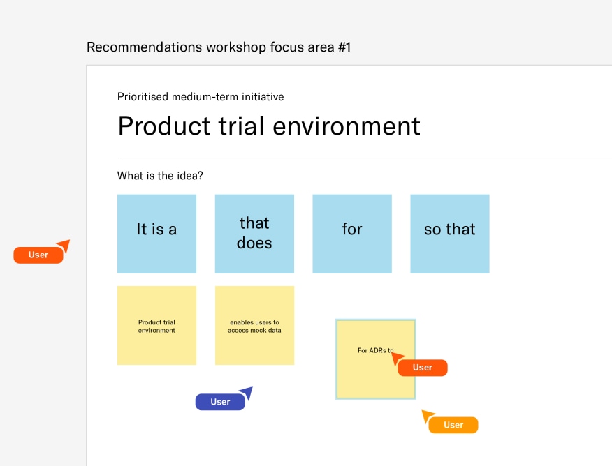
In the second research stream, we took a few different product concepts and let users explore them. We had a vast amount of different data we could give users, so we had to narrow it down to what people actually want to see, so as not to overwhelm them with unwanted data clutter.


Speaking the customer’s language
In the third research stream, we tested our refined prototypes. In this phase we let users effectively ‘build’ their own dashboard, selecting different types of info conveyed in different ways. We found, for example, that users strongly preferred a variant on a stacked bar chart, because it’s the way NAPLAN data is displayed. It may not be the flashiest piece of data viz, but it’s one many Australians are highly literate in

