MONA
Improving the ticketing experience at MONA
The Museum of Old and New Art wants to challenge and disturb visitors – but their ticketing system was a bit too challenging.
Outcomes
-
User journeys and flows for five primary visitor groups, with wireframes and interactive prototypes
-
A set of user stories to set the functional and interactive requirements of the new system
-
MONA launched the new system, which we designed and prototyped, with no downtime while moving visitors off the old platform
-
Checkout cut from three pages of forms to a single page, with guest checkout so nobody is forced to create an account
-
Museum entry and a restaurant reservation booked in one transaction, instead of on two separate websites
-
After launch, museum entry bookings rose 5%, ferry bookings rose 17%, and combined entry and ferry bookings rose 20%
-
Bookings for tours and tastings rose 46%
From "excruciatingly tedious" to "really smooth"
MONA approached Paper Giant for service design support to improve their online ticketing experience. They were completely aware of the problems (having received some pretty painful customer feedback), but it was a complex challenge to solve them: the existing system had become increasingly confusing as additional elements were bolted on over time. MONA isn’t just an art gallery – or even like a festival. It has its own ferries, there are events, dining experiences, exclusive exhibitions, shows and so on. There’s nothing else like it, and so there’s no off-the-shelf ticketing system that would do the job.
In with the new
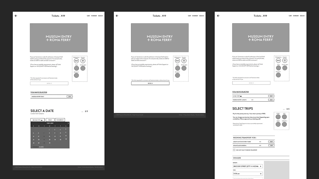
The new system lets visitors combine general admission, timed exhibitions, winery and restaurant options, ferries, buses and bikes in a single booking. It flags when something you pick clashes with something you have already booked, so you can plan a full day without worrying about double-booking. Museum entry and a restaurant reservation now happen in one transaction, where before they meant separate purchases on different websites.
It also asks for far less personal information, which had been another sore point with the old system. The old checkout ran to three pages of forms and made everyone create an account before they could buy a ticket. The new one is a single page, and you can check out as a guest.
Close collaboration
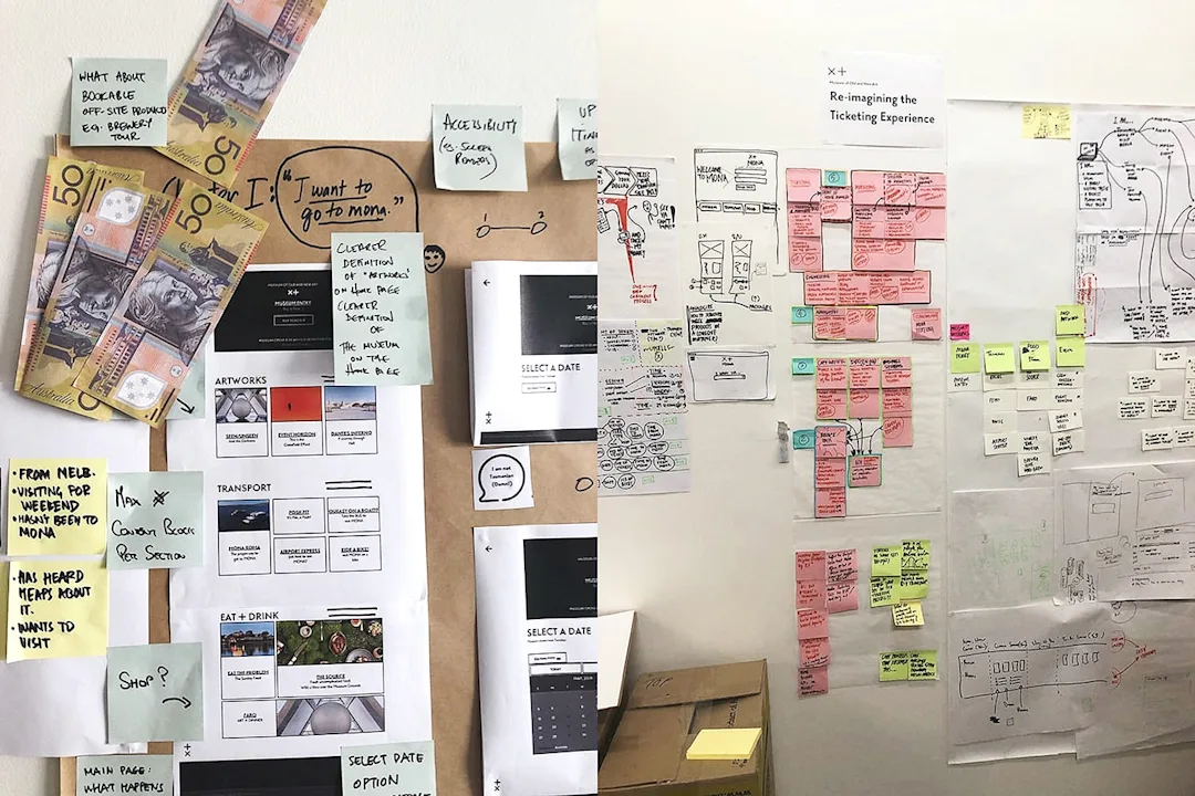
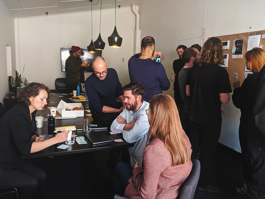
We used existing best-practice research and conducted additional research to deeply understand their users’ requirements, and how these sat alongside the business and development requirements.
We worked collaboratively with members of the MONA digital team to design and prototype the new purchase and booking experience, including UX recommendations, IA and interface designs for their revamped online ticketing system. We worked on a really fast iteration cycle, with twice-weekly testing.
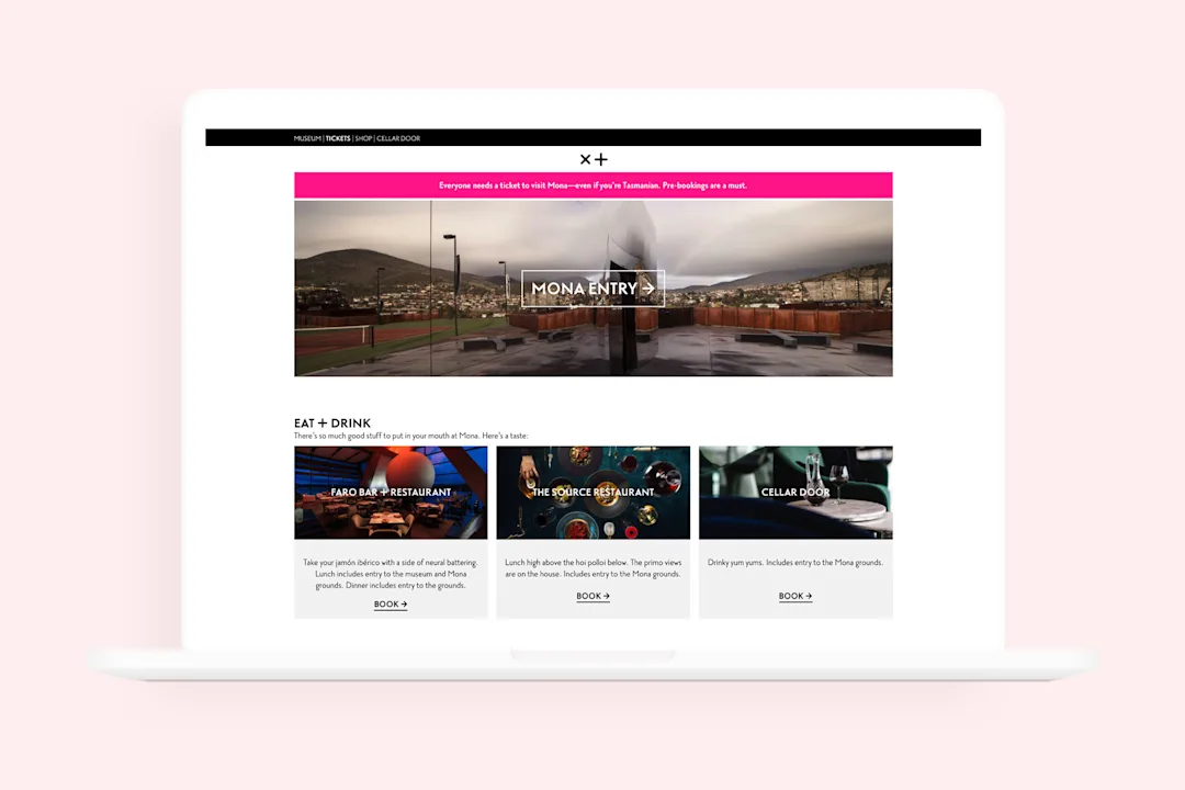
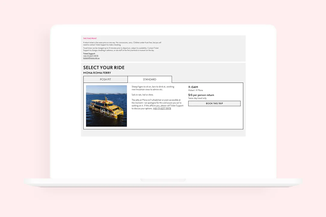
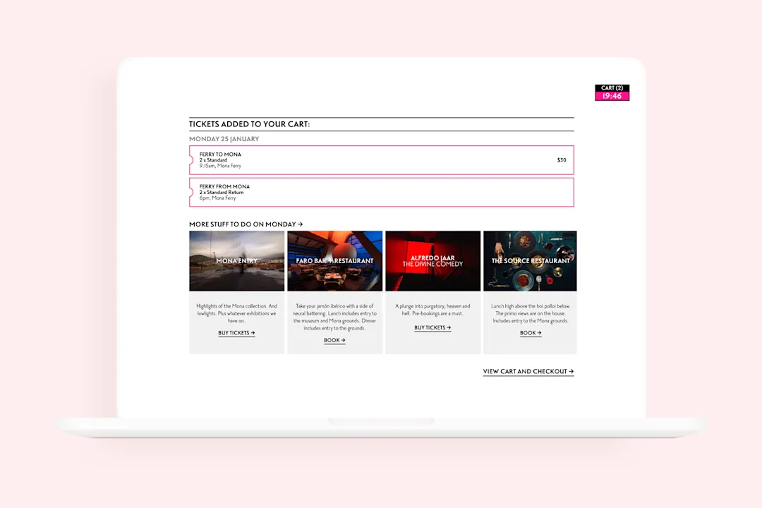
The booking flow on the live website that integrates museum entry, transport and experiences into one seamless journey.
Keeping the experience weird (but easy)
MONA has a very strong, very weird, very intense brand. Good UX is comfortable, but MONA doesn’t want its visitors to feel comfortable. We resolved this tension between the brand experience and the UX experience by making the purchasing processes as straightforward and easy as possible, and then using the microcopy as an opportunity to emphasise the MONA brand.
Wherever there’s fine print and terms of conditions, these can be read out by an embedded text-to-speech service. This is great for accessibility, but it is also – because of the voices used – deeply unsettling.