Supreme Court of Victoria
Empowering Court Users: A UX Strategy for Accessible Justice at the Supreme Court
We worked with the Supreme Court of Victoria to re-design their user experience. The archetypes we developed are now used as a training tool for staff, so that they can continue to sustainably improve their user experience themselves.
Outcomes
-
Original primary research into Supreme Court users, and the development of a taxonomy of needs
-
A new service value proposition for the Supreme Court
-
3 high-fidelity prototypes, including a supporting Supreme Court video series and a digital approach that explains the case process in plain English
-
Exploration of the feasibility of the prototypes, a three-stage implementation plan, engagement strategies and risk mitigation
Services
- Service Design
- Product Design
- Customer experience
Sectors
Supporting access to justice by focusing on the needs of court users
Since 2014, the Supreme Court of Victoria (SCV) has been undergoing steady waves of change, marking a significant phase in the modern history of the court. Their goal was firmly set – to make justice at the Supreme Court open and accessible for all. To achieve this, they made the strategic choice to focus on improving the service provided by the Registry, the interface between the judiciary and the people who bring cases to the court.
The Reimagining Registry Services (RRS) initiative is a significant, multi-year program of work that seeks to improve the registry from many angles – staff capability, data collection, community outreach and more. Paper Giant were engaged to solve the user experience piece of the puzzle. Our work was one of over 21 RRS projects running concurrently over 2020.
Registry staff were reporting that much of their time was spent supporting litigators and self-representatives, making it crucial to address the core problems, needs and wants of the court user.
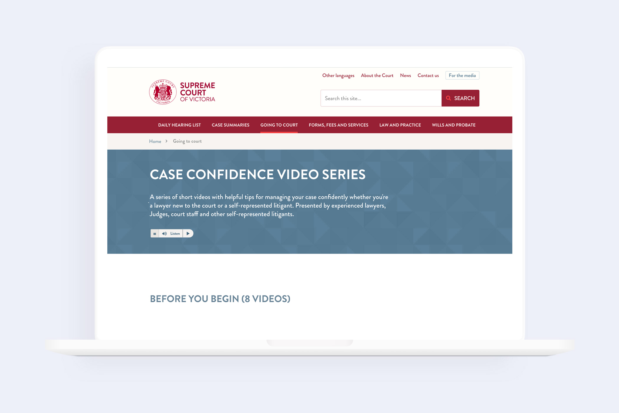
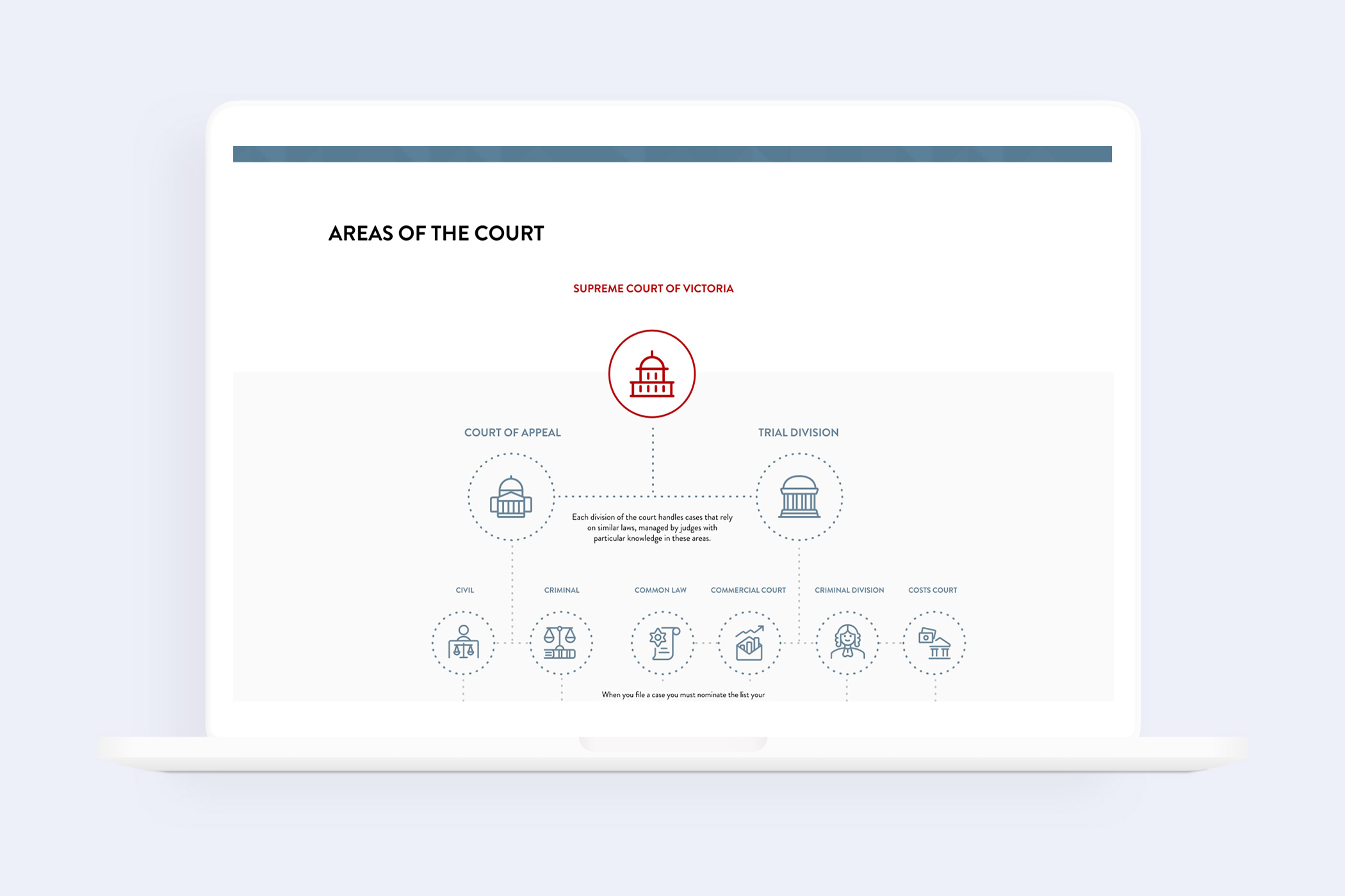
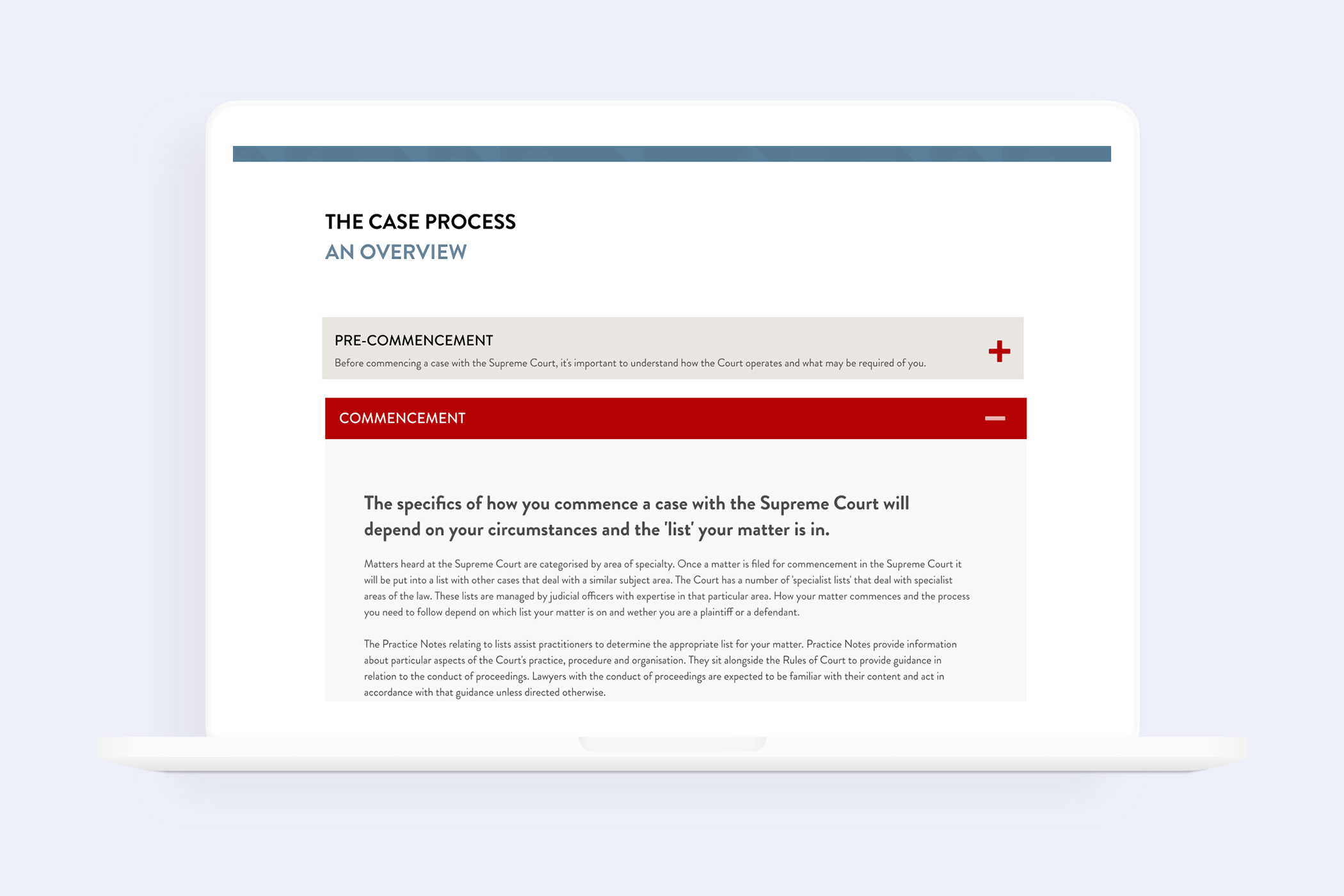
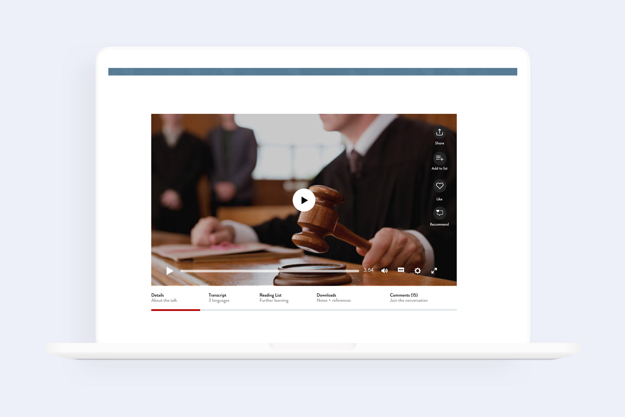
A set of user experience prototypes developed for the project
Helping registry staff understand their customers
In-depth research with the registry user base uncovered archetypes of behaviour that the staff had observed but did not have a framework for understanding. We developed a behavioural model that helped staff understand different types of users and what kind of support they would need.
Using this model, we were able to develop a clear digital strategy for reaching these users and meeting their needs, while taking pressure off frontline registry staff.
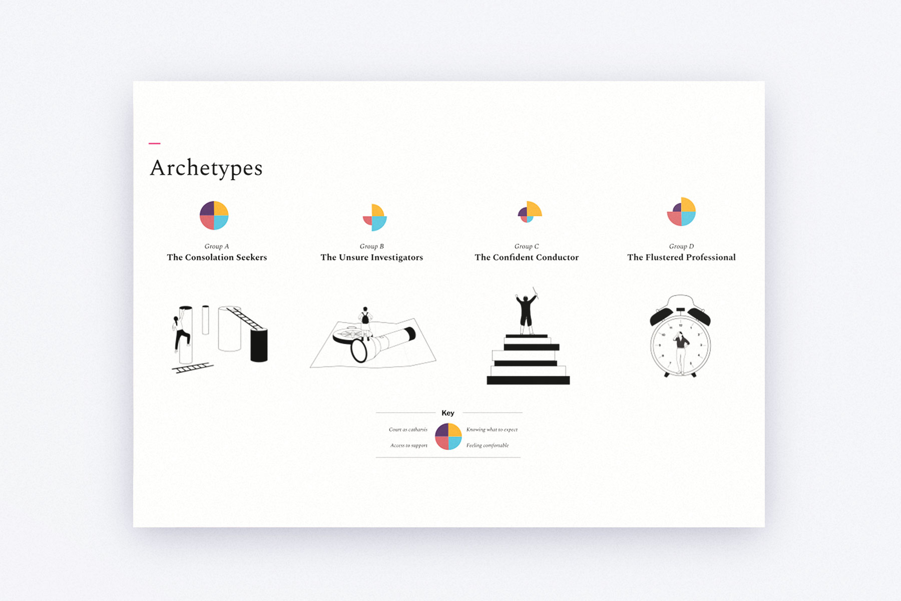
A page from the report showing the archetypes created as part of the project.
We are already seeing our teams use the archetypes as a way of adjusting how they respond to people who come to the court.
Prototyping with both user groups: customers and staff
We worked closely with users and members of staff to co-create, develop and test high-fidelity prototypes of a new section of the SCV website that would address the customer problems we had now identified.
We had a clear understanding of the organisation’s strategic goals, so we were able to develop prototypes that furthered the court’s strategic objectives, while also directly solving user problems.
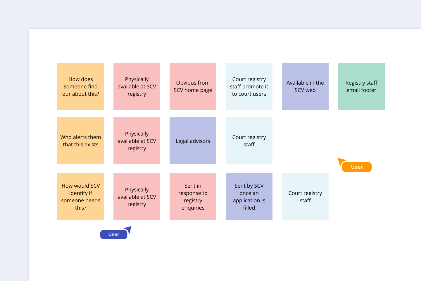
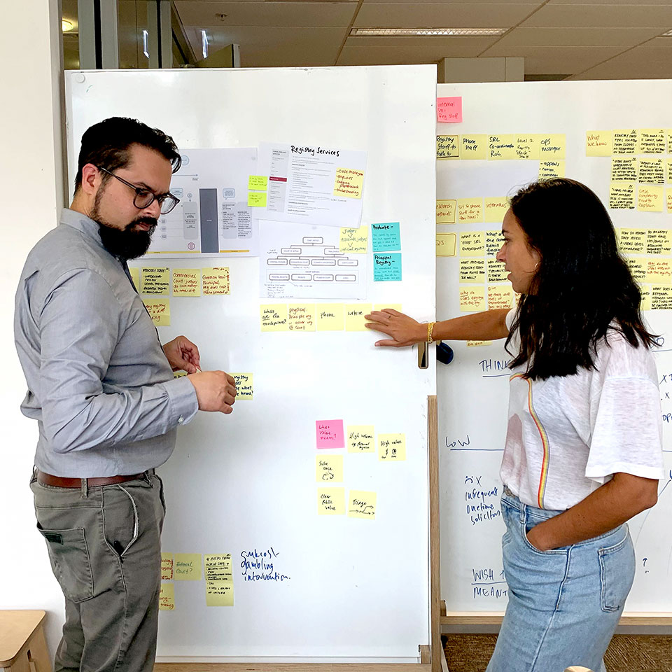
An collaborative ideation exercise run as part of an online workshop
I had a chat with one of the other managers in the hallway about how much we are loving this process. You’ve made it so easy to make something that could actually work.
You made it very clear how this work connects with our goals as an organisation and pushes us towards achieving them. It makes it easier for us to have conversations behind the scenes.
Building in organisation transformation from the start
Identifying key stakeholders early and in collaboration with the SCV team meant we found meaningful opportunities throughout the project to introduce and test increasingly significant ideas over the course of the project.
We worked with the project team to identify what steps they would need to take after our engagement ended. The team’s next task was writing a business case, so we made sure our final deliverables seamlessly flowed into that task. Our final report was full of plug-and-play pieces they can use to create buy-in throughout their organisation, write a business case, and clearly show the value of the project.
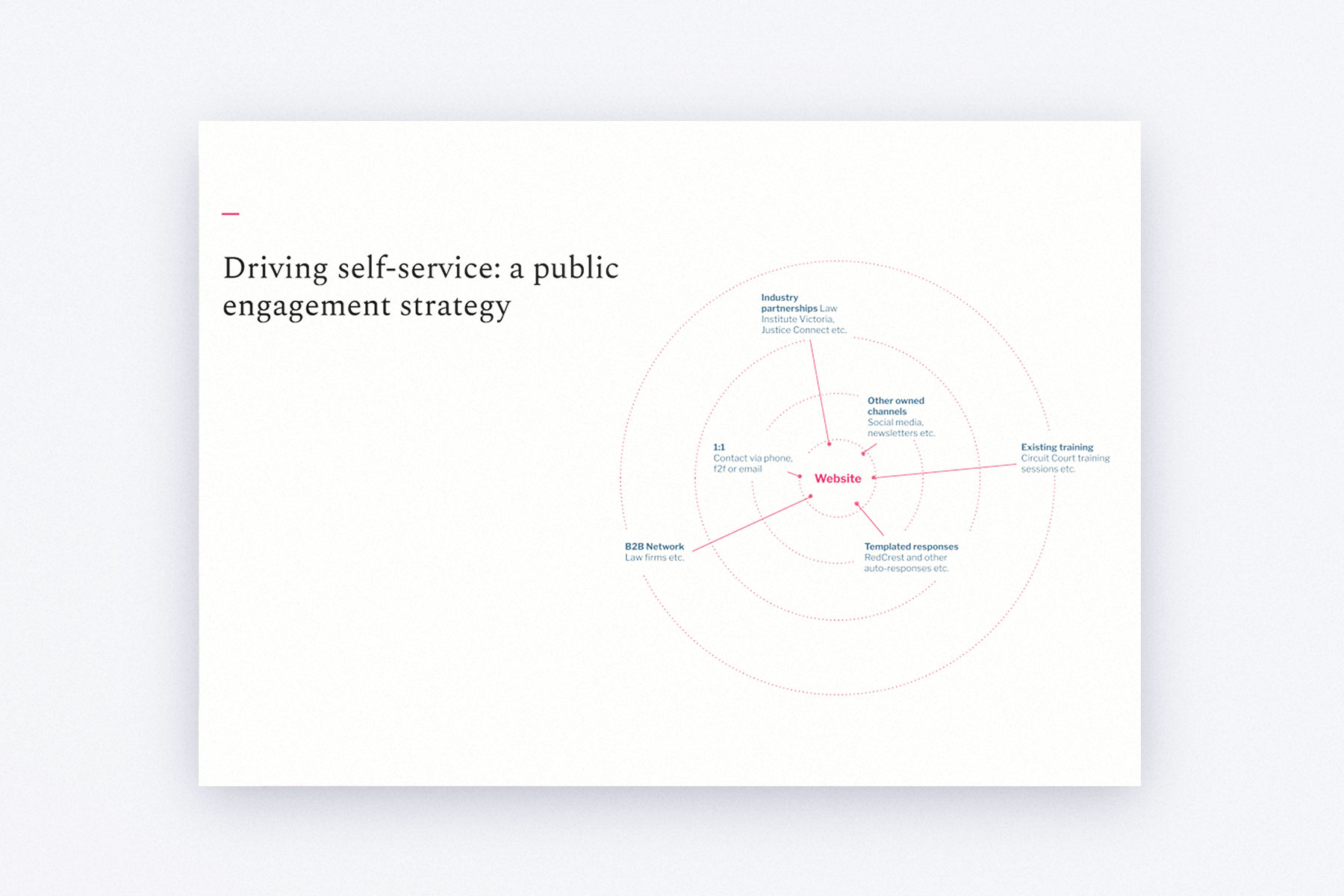
A page from the final strategy showing how the website can be an effective driver of self service.
We loved the way you easily communicated with members of the court in such an engaging manner – everyone is as excited about this project as we are.
What you’ve done will go a long way to helping us write the business case – portions of it are here already.
Switching to remote research and design in the midst of COVID-19
The global pandemic began halfway through our research phase, forcing us to switch to online. This had an unexpected effect on our interviews – when participants were sitting in their own home in a comfortable environment, they were more candid and helped us get to the crux of their issues more easily.
The move to online also meant that we had to rethink how we would run our design sprints. We reasoned that, since, large groups don’t work well online, perhaps we could get smaller teams to pass the ‘baton’ (the design work) to each other within each iteration. This three-iteration ‘design relay’ had the unexpected outcome of remarkably high-quality creative outputs, possibly because people had more breathing room to think creatively within their comfort space.
