ArticlesApril 29th, 2019
Harnessing the power of visual journalism for research

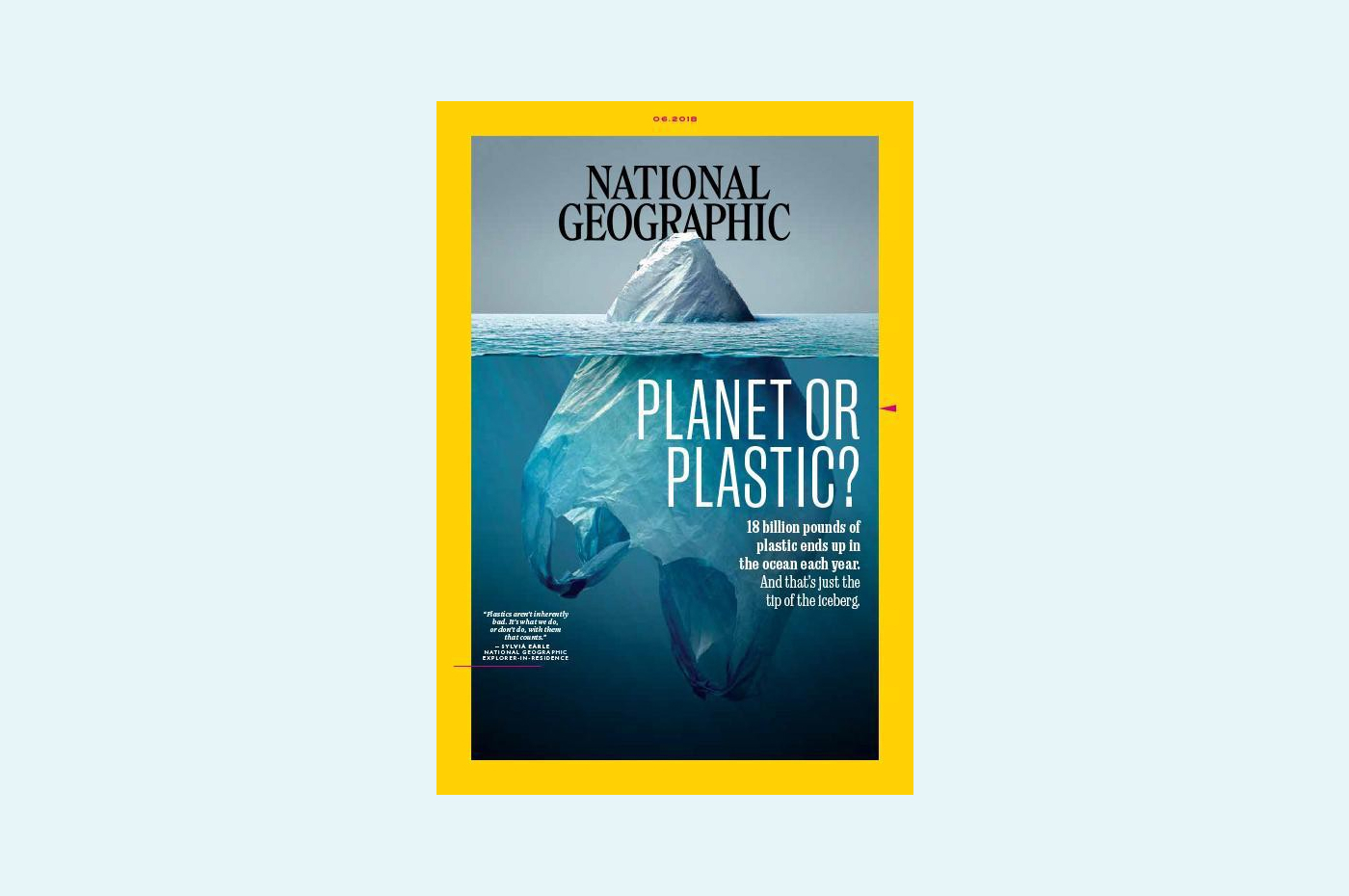
Examples of provocative magazine cover design — National Geographic June 2018.
Last year National Geographic released their June issue with an obviously altered yet realistic-looking photograph of a plastic bag floating upside-down in the ocean, one corner sticking up above the surface of the water. The plastic bag feels sharp and frosty, the water glowing and mysterious. It was clearly designed to resemble an iceberg in arctic waters, and barely needed the title it came with: ‘Planet or Plastic?’ Altogether it was horrifying and genius and I couldn’t stop staring at it.
For as long as I can remember I have always loved visual journalism. I find the endless variations of typography, colour and images satisfying, enticing and moving. Like the National Geographic cover, the pinnacle of design success is a brilliantly conceived, meticulously crafted piece of communication that tells you everything you need to know — carrying depth, nuance, emotion and a compulsion to do something. Whether clever, sad, damning or informative, work that carries that kind of impact has always been and still is my design ambition.
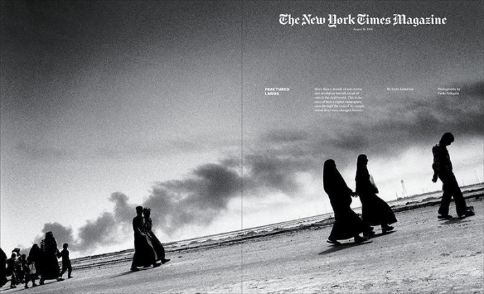
New York Times Magazine cover and interactive — ‘Fractured Lands’
By Scott Anderson with photographs by Paolo Pellegrin, 11 August 2016.
Note the angle of the ground in this photo, giving the viewer a visceral sense of how unstable the world of these people has become.
Attention without feeling is only a report
— Mary Oliver
Having worked in design contexts from architecture to editorial, digital to conceptual image-making, I am now the Creative Lead at Paper Giant, a strategic design consultancy based in Melbourne. We combine research, strategy and design to solve complex problems. My job is to find the most effective way to translate ideas and information into easily absorbed communications (mostly reports) to help people make decisions. It’s a tricky challenge.
At Paper Giant we deal with the stuff of what it means to be human. Depending on the context, there are times I want my work to hit a nerve, when I want our clients to be closer to what we are doing with them. I want them to look at a visualisation and fully comprehend what’s at stake.
Unlike traditional graphic design, there is very little time to develop concepts or craft polished work when producing these reports. They also need to be designed to let clients quickly get salient information by scanning, while also rewarding a more in-depth read.
I worry about these reports (not the research itself). Are they as effective as they could be? Are they memorable? Do they inspire action? I am on a mission to design better reports. So, for inspiration, I am looking to other organisations with a similar need to maximise how they deliver knowledge — I am looking to visual journalism.
Context is how humans remember information.
According to neuroscientists, we need context in order to retain information. If I give you a list of a hundred words to remember, you’ll forget them pretty quickly. If I give you a hundred words in picture format you’ll do a bit better. But if I turn those hundred words into a story, you’ll have no trouble at all. Neuroscientists, who conducted the experiment I just outlined, claim this is because we create associations between ourselves and the story, and these personal associations make it easy to remember. This is why we need context to be able to create new mental concepts.
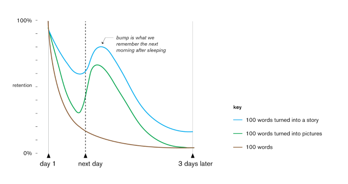
Chart adapted from Dr. Jared Horvath
Visual journalism
Visual and traditional journalism use similar methods for gathering information, but they differ in how they pass that information on to their audiences. The latter relies primarily on literary techniques (similes, alliteration, rhetoric, etc.) while the former adds the power of non-verbal communication through careful manipulation of imagery. Descended from magazine design (also propaganda design and documentary filmmaking), visual journalism is rich, experimental, multimedia storytelling with the primary role being played by designers, photographers, videographers and graphic editors. It expands our understanding of the world and helps us navigate it.
This distinctive form of journalism is growing because how, where and why we read is changing and newsrooms are evolving in response. It is effective because visual language resonates with a wider range of humans and communicates faster than traditional writing. It has enormous power to convince and change minds. (Visual journalism can also refer to photojournalism and data journalism.)
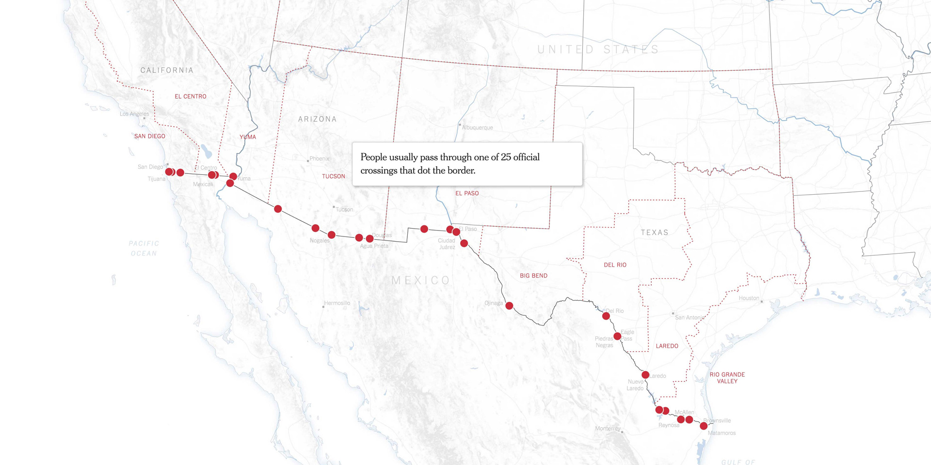
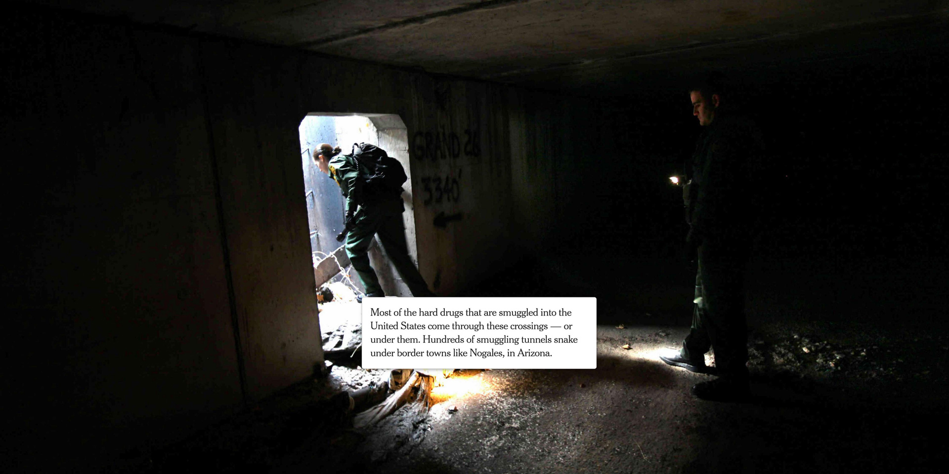
Interactive visual journalism — ‘Trump Wants a Border Wall. See What’s in Place Already.’
By Sarah Almukhtar And Josh Williams Updated Dec. 13, 2018
New York Times nytimes.com/interactive/2018/02/05/us/border-wall.html
Traditionally, the reporter who gathered the information would also create the written story. But with visual journalism, the skills of form and function overlap: the reporter’s work is shaped by their awareness of how the end result will be presented, and the designer’s work is shaped by awareness of the story that needs to be told. It’s a yin-yang relationship, with each role sharing some of the other’s skills. This is very similar to how I see the roles of design researcher and communication designer at Paper Giant.
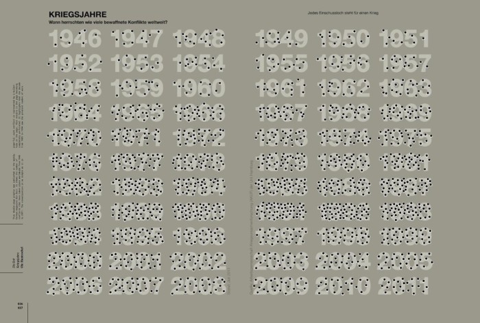
‘Kriegesjahre’ [War Years], by Ole Hanzschel (2011).
This visualisation shows the number of armed conflicts that took place worldwide in each year from 1946–2011.
Using bullet holes is much more effective than a bar chart of the same data: it’s a perfect match of context to data.
Even the colour suggests ‘military’ rather than ‘gun homicides’.
No one is going to look at this image and think it represents, say, the number of twins born per 1,000 births.
Visual journalism at Paper Giant
Last year the Department of Home Affairs approached Paper Giant to conduct ethnographic research in Myanmar so they could better understand the experiences and life stories of refugees from Chin State.
Over the last 20 years, Australia has granted protection visas to many thousands of refugees from Myanmar. Having made a home for themselves here, these people are now eligible to apply for Australian citizenship. To do so, they need to prove their identity, but many don’t have the traditional ‘100 points’ of documents that a natural-born Australian would use. Instead, their life story — their memories and experiences — is their proof of identity. Paper Giant’s job was to help the government understand typical life stories of people from Chin state, especially where there are cultural differences.
With data collected during the fieldwork, we created an identity document field guide, a migration journey map, a life story guide and detailed place guides. These field guides became the ‘tools’ used by case workers.
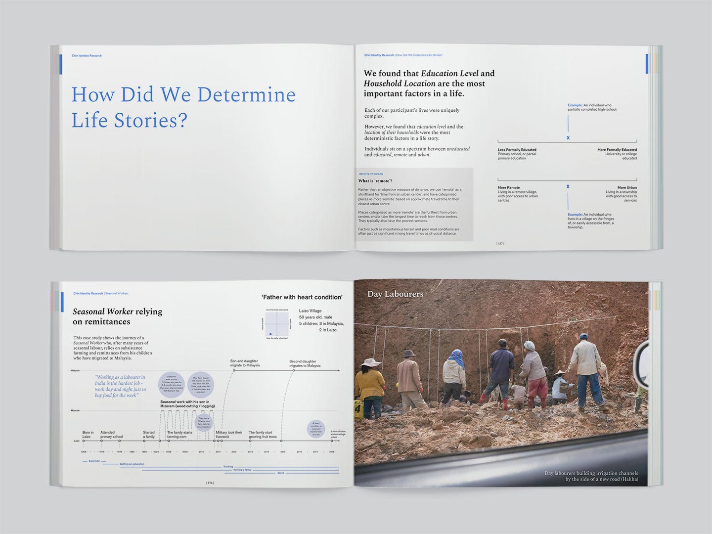
Pages for the Life Stories guide
Given the potential impact on people’s lives, this project came with a responsibility not only to create empathy but to get these stories right. The information needed to be clear and immediate and to connect to its audience (case workers) on an emotional level. While there were more traditional, report-like elements, we were able to communicate so much more effectively by including data visualisation and photography.
I believe that working this way will help us to support our clients to deliver change and I am looking forward to doing more–- to incorporating the craft of storytelling, journalism, precision, simplification and beauty.


